 English


![swimsuit edition [abbb] - 1.20 21 swimsuit edition - chapter](https://mymagazine.blog/wp-content/uploads/2025/09/swimsuit-edition-abbb-1.20-21-swimsuit-edition-chapter1-1024x574.webp)


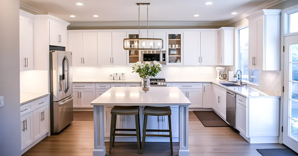
Subway Tile Backsplash Ideas to Refresh Kitchens and Bathrooms

That builder-grade backsplash you’ve been staring at for years? It’s fine. Not offensive, not exciting—just there. Like a beige sweater nobody asked for but everyone seems to own. The truth is, you don’t have to gut your entire kitchen or bathroom to make it feel completely different. A smart backsplash choice does most of the heavy lifting, and subway tile—yes, that classic workhorse—has way more personality than the basic white-horizontal-brick-pattern stereotype suggests.
Subway Tile Backsplash Design Trends Shaping 2026
Look, the traditional 3×6 white subway tile isn’t dead. Not even close. But how we’re using it has shifted dramatically. Here’s something that might surprise you: installing a tile backsplash costs on average $1,000-1,250, with ceramic options running as low as $600-750 (remodelingcalculator.org). That’s legitimately affordable compared to most kitchen upgrades, and the impact-per-dollar ratio is tough to beat.
What’s hot right now? Elongated proportions. We’re talking 2×8, 3×12, even 4×16 tiles that stretch horizontally and create these gorgeous, uninterrupted sight lines. Handcrafted-looking surfaces with slight waves and irregular edges bring character that machine-perfect glossy tiles just can’t touch. People are also mixing finishes—matte paired with gloss in identical colors—which creates this subtle dimensional thing that shifts as light moves through your space.
Then there’s the full-height trend. Counter to ceiling, wall to wall. It’s showing up in kitchens and showers alike, turning what used to be a functional afterthought into a legitimate design statement. Color-wise, we’re seeing warmer neutrals—think mushroom, greige, soft putty—replacing that clinical stark white. And for the bold? Ink blue, olive green, even oxblood reds are having a moment.
The fastest way to update subway tile backsplash ideas? Change just one variable: tile size, layout pattern, grout color, or finish. Seriously, just one shift transforms everything.
Subway Tile Size + Proportion Cheatsheet
The classic 3×6 still works, don’t get me wrong. It’s dependable. Safe. But if you’re not thoughtful about layout, it reads “contractor grade” pretty fast. These proportions shine in tighter spaces where bigger tiles would visually overwhelm.
Elongated formats—your 2×10 or 3×12 options—feel current without screaming trendy. They create horizontal flow that can actually make cramped galley kitchens appear wider than they are.
The 4×16 format? That’s your sleek, modern option with fewer grout lines, which means less scrubbing later. Practical and pretty.
Here’s something counterintuitive: in small bathrooms, larger tiles can make rooms feel more spacious by cutting down on visual clutter. In big, open kitchens, though, you might want to mix sizes or create a framed focal section behind your range to avoid monotony. Scale matters way more than most people realize when you’re planning a modern subway tile backsplash installation.
Finish and Texture Choices That Change the Whole Room
Glossy finishes are classic for good reason—they reflect light beautifully. They also show every water droplet and fingerprint, which gets old quickly if you’re not naturally tidy. Matte surfaces give you that softer, more contemporary vibe and forgive minor messes. Satin splits the difference: some shine, less maintenance drama.
Handmade or rippled textures add organic depth that flat tiles can’t replicate. But pay attention to how your lighting interacts with texture. Always—and I mean always—test sample tiles under your actual light bulbs before committing. Warm LEDs versus cool fluorescents can make the same tile look like two completely different colors. The finish you pick affects not just aesthetics but your daily life.
Kitchen Subway Tile Backsplash Layouts That Look Custom
Your kitchen subway tile backsplash layout is what separates “we thought about this” from “the contractor did whatever was fastest.” Traditional horizontal running bond? Fine. Functional. But alternatives can elevate your space instantly without adding material costs.
Vertical Stack for a Modern Look
Flip the script. Stack tiles vertically instead of the expected horizontal, and you get clean lines that pull the eye upward. Low ceilings suddenly feel taller. This works beautifully with contemporary flat-panel cabinetry and minimalist hardware—the grid effect feels architectural and deliberate.
This layout really shines when your cabinetry is simple and won’t compete visually. Got lots of open shelving or limited upper cabinets? Vertical tile adds structure without visual chaos.
Herringbone + Ladder Layouts for Statement Areas
Herringbone creates movement and visual interest without feeling too busy—if you limit it to focal zones. Your range wall. A coffee bar nook. That zigzag pattern naturally draws attention where you want it. Ladder layouts, where you alternate short and long tiles, give a similar effect with less cutting and waste.
The trick? Use these intricate patterns strategically, not wall-to-wall. Plan your centerline carefully around your hood or range so the pattern flows symmetrically from the middle out. That bit of extra planning is what makes the difference between custom-looking and just confusing.
Full-Height Kitchen Installations
Taking your subway tile backsplash design all the way from countertop to ceiling creates serious drama, especially in kitchens with open shelving or minimal uppers. Instead of a functional strip, you’ve got a feature wall. The continuous surface feels intentional, modern, and honestly pretty luxurious—though it does require more material investment.
To keep costs reasonable, consider full-height treatment only on your hero wall—usually the range area—while keeping other sections at standard splash height. You still get that visual punch without doubling your tile budget.
Bathroom Subway Tile Backsplash Ideas for Vanities and Showers
Bathroom subway tile backsplash applications work differently than kitchens. Moisture management matters more. Height proportions around mirrors and lighting need more careful thought. What looks amazing behind a cooktop might fall flat behind a sink.
Vanity Wall Backsplash Heights
A tiny 4-inch splash protects your wall but can look like you ran out of tile mid-project. Extending to 8-10 inches creates more visual presence while staying practical. Full-wall treatments behind vanities make bold statements when you’ve got gorgeous tiles worth showcasing.
Interesting data point: Home Remodeling Trends 2022 shows that 34% of homeowners renovating their bathrooms opt for vintage or retro styles, with subway tiles being a top flooring choice due to their timeless appeal (crescatsententia.org). Your mirror and sconce placement should align with tile edges for balanced proportions—planning these together prevents awkward transitions and weird cutoffs.
Shower Subway Tile That Feels Spa-Level
Vertical stacking or large-format subway tile in showers means fewer grout lines to maintain long-term. And while subway tile rocks on walls, stick with smaller mosaics for shower floors where slip-resistance trumps pattern continuity every time.
Material matters here: porcelain subway tiles handle constant moisture better than ceramic versions. They maintain their appearance despite daily steam and water exposure. When durability is non-negotiable, don’t cheap out on material quality.
Niches and Transitions
Built-in shower niches look most intentional when positioned at eye level and aligned with your tile’s grout lines. This alignment makes the niche feel integrated instead of randomly punched into the wall as an afterthought. Using quartz or stone remnants for niche shelves adds subtle material contrast while keeping things waterproof.
Where tile meets painted walls, you need clean edge details. Schluter trim in matte black or brushed nickel creates crisp boundaries that feel finished and professional. These small touches separate DIY-oops from designer-quality results.
Color Strategies for Subway Tile Backsplash Design
Color changes mood faster than anything else in design. Same tile layout, same material—completely different emotional response based purely on color selection.
Warm Neutral Subway Tile Ideas
Cream, putty, and greige tones feel organic and inviting compared to stark white. These warmer neutrals pair gorgeously with oak or walnut cabinetry, brass fixtures, and off-black hardware. The soft white approach prevents that sterile, hospital-lobby vibe that can make kitchens feel cold instead of welcoming.
These shades really shine in spaces lacking abundant natural light, where pure white can actually look dingy and gray. The subtle warmth makes rooms feel lived-in and loved from day one.
Deep Color Kitchens and Bathrooms
Navy, forest green, charcoal, terracotta—these make confident statements when used thoughtfully. Reserve bold colors for focal walls behind your range or vanity rather than entire rooms. Balance darker tile with lighter countertops and adequate lighting so spaces don’t feel like caves.
Under-cabinet lighting becomes especially critical with deeper colors, preventing shadow zones that make cooking prep genuinely difficult. The drama these colors provide is absolutely worth the extra planning they demand.
Grout and Edge Details That Upgrade Subway Tile
Most people obsess over tile selection and treat grout as boring background noise. Big mistake. Grout color and edge treatments can elevate or completely undermine even the most beautiful tile choices.
Grout Color Matrix
Dark grout with light tile creates graphic contrast that feels modern and hides stains way better than white grout ever could.
Mid-tone grout is the most forgiving choice, splitting the difference between dramatic contrast and seamless blending. Matching grout to tile color creates calm, seamless luxury that lets tile texture take center stage.
Epoxy grout costs more upfront but resists stains and mold better than cement-based options—worth every penny for bathrooms and heavy-use kitchen zones. Pre-mixed urethane grout offers easier application for DIYers but can’t handle high-heat areas near ranges.
Edge Profiles and Trim Alternatives
Metal trims in brushed nickel, matte black, or brass create clean transitions at corners and endings. Bullnose tiles round edges softly while mitered corners deliver sharp, contemporary lines. Pencil liners add decorative detail without visual overwhelm.
Best practice? Match your trim finish to your faucet and hardware finishes for visual cohesion. These tiny details might seem insignificant during planning, but they’re what people notice subconsciously when a space just feels right.
Common Questions About Subway Tile Backsplashes
Are subway tiles still in style for 2026?
Absolutely, yes. While the basic white-horizontal-brick pattern feels dated and played out, subway tiles remain wildly popular when installed with modern layouts, updated proportions, and intentional color choices. The format itself is timeless—execution is what makes or breaks it.
What subway tile size looks most modern right now?
Elongated formats like 3×12 and 4×16 feel more current than standard 3×6. Larger sizes reduce grout lines and create sleeker sight lines that read contemporary without trying too hard or chasing trends.
Should grout match or contrast with subway tile?
Both approaches work beautifully—it depends on your goals. Matching grout creates seamless sophistication and calm. Contrasting grout, especially dark with light tile, delivers graphic modern impact. Choose based on your overall aesthetic vision and honest maintenance tolerance.
Wrapping Up Your Backsplash Refresh
The real beauty of subway tiles? It adapts to your style instead of dictating it. Whether you’re drawn to warm neutrals or bold statement colors, vertical stacks or herringbone patterns, the combinations are nearly endless. Focus on getting proportions right, choosing grout intentionally, and planning layouts that feel deliberate rather than default.
Small details like trim selection and tile finish might seem minor during the planning phase, but they’re what actually transforms standard into stunning. Your backsplash refresh doesn’t require perfection—just thoughtful choices that reflect how you actually live in your space.
For More Visits: Mymagazine
